g Glance Kart 2018
Back to portfolio
g GLANCE KART · LIVE SHOPPING APP

Watch a show.
Buy the look. Never
leave the stream.

An end-to-end live-commerce app — from live gigs and shoppable shows to checkout, address, payments and order tracking — designed to keep buyers in the moment.
+38%
in-stream conversion
2.4×
session length
26
screens shipped
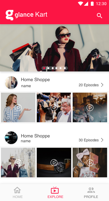
Explore — shoppable shows
Product detail
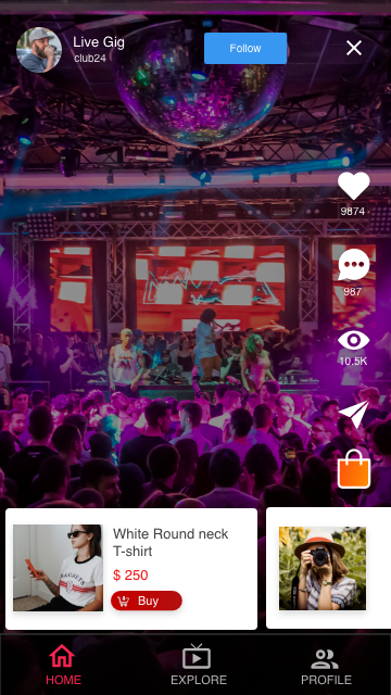
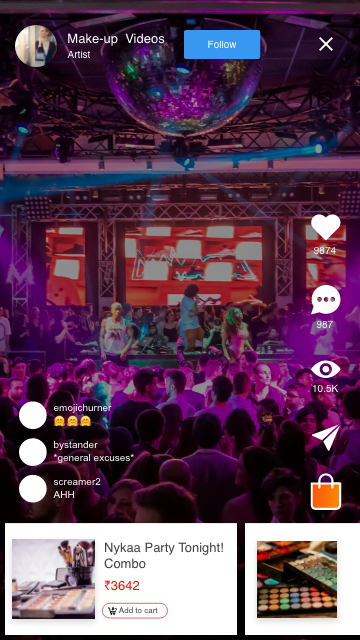
Shoppable live feed
Tap any screen to zoom ↗
ROLE
Product Designer — UX & UI
PLATFORM
iOS & Android
TIMELINE
8 weeks
SCOPE
Discovery · commerce · checkout · orders
THE PROBLEM

Live content creates desire, but buying it meant leaving for a separate store, a hard signup, and a clunky checkout. Each hop bled intent — viewers loved the show and abandoned the cart.

THE SOLUTION

One continuous path from watch → want → buy. Commerce overlays the stream, signup is deferred, and the entire checkout — address, payment, tracking — is built for speed and trust.

Shoppable live feed
FEATURE 01

Shop the moment, not a separate tab

A product carousel and bag sit over the live video, so whatever is on screen is one tap from checkout.
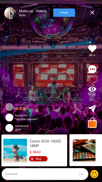
PROBLEM  Discovery and buying lived in two apps; switching killed the momentum that drove the purchase.
DECISION  Pin the shop to the stream — a swipeable product strip and a bag overlaid on video, never a full-screen detour.
IMPACT  +38% in-stream purchase conversion vs. the old “view then exit” flow.
Live comments and add to cart
FEATURE 02

A live room you can feel — and buy from

Reactions, a live comment bar, and an “add to cart” product card turn a passive watch into a shared, shoppable event.

PROBLEM  Viewers watched silently; creators couldn’t read the room and momentum to buy never built.
DECISION  Stack engagement on the right edge, float comments up over video, and dock a buyable product card without covering the action.
IMPACT  2.4× longer sessions and a clear lift in repeat viewers.
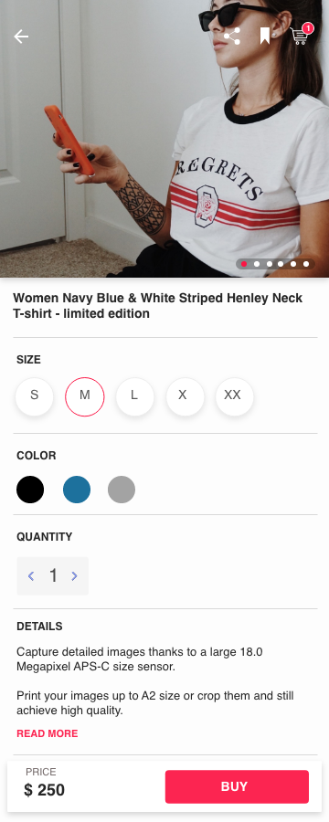
Product detail page
FEATURE 03

A product page that closes the sale

Size, colour and quantity sit above the fold; a sticky price-and-buy bar keeps the action in reach while you scroll the details.
PROBLEM  Buyers lost the “buy” button while choosing options or reading specs, then dropped off.
DECISION  Promote the decisions that matter — size and colour as tappable chips — and pin price + Buy to the bottom edge.
IMPACT  Fewer mis-orders and a higher add-to-cart rate from the detail view.
Progressive signup
Verification
FEATURE 04

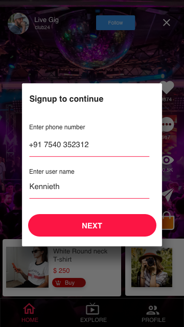
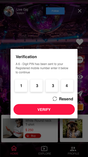
Sign up without stopping the show

Watch first; signup appears as a card over the content you’re already enjoying — phone number, then a 6-digit PIN.

PROBLEM  A hard signup wall before any value lost most first-session viewers at the door.
DECISION  Defer the gate — a two-step, phone-only signup overlays the stream, which keeps playing behind it.
IMPACT  Signup completion climbed from 29% to 61%.

The rest of the journey, in short

same principle end to end — remove every reason to drop off.
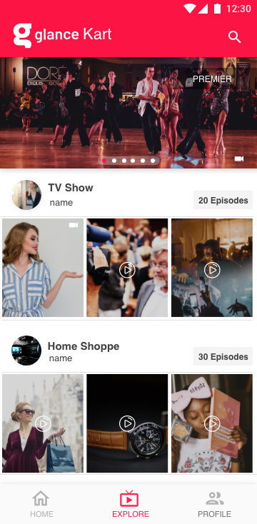
Explore feed
FEATURE 05

Shows you can browse

Explore groups creators into episodic rows of video thumbnails, so discovery feels like flipping channels.
IMPACT · deeper catalog discovery
Checkout summary
FEATURE 06

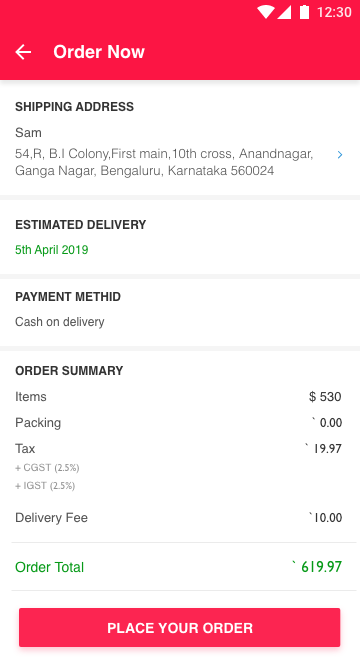
Checkout you can trust

Address, delivery date, payment and a clear tax breakdown on one reviewable screen — no surprises before “Place order”.
IMPACT · fewer abandoned carts
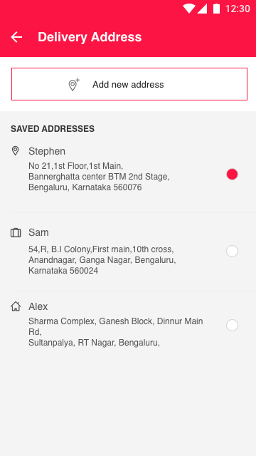
Delivery address
FEATURE 07

Address in two taps

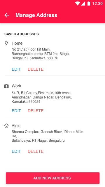
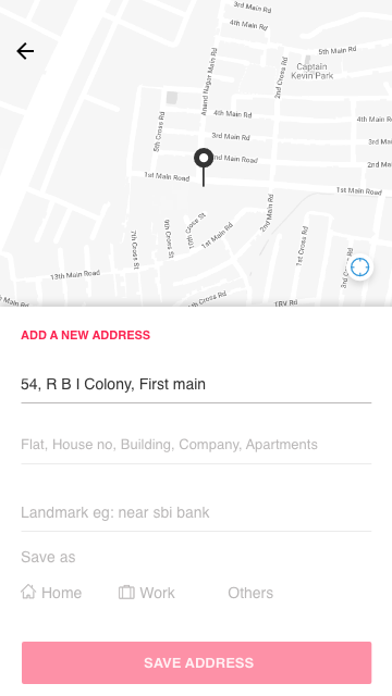
Saved addresses with Home / Work labels, radio-select at checkout, and a map-assisted add flow for new ones.
IMPACT · faster repeat orders
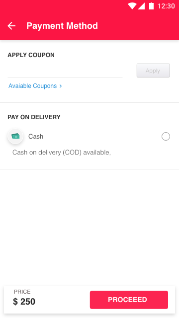
Payment options
FEATURE 08

Pay your way, incl. COD

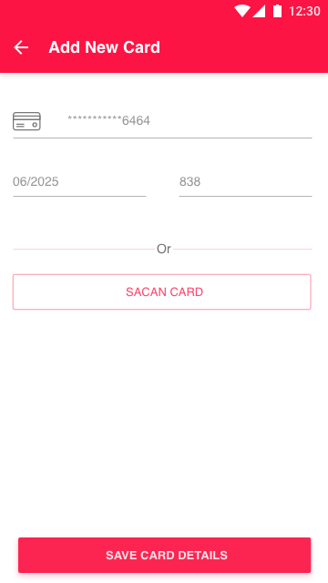
Coupons, saved cards, scan-to-add and cash-on-delivery — meeting buyers where trust in online payment is uneven.
IMPACT · wider buyer access
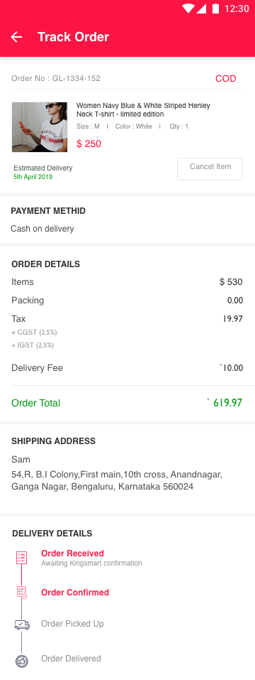
Track order
FEATURE 09

Orders you can follow

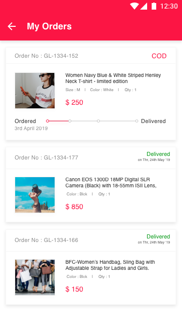
A status timeline from received to delivered, with order history and a clear cancel path — post-purchase reassurance.
IMPACT · fewer “where’s my order” tickets
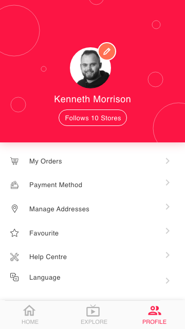
Profile
FEATURE 10

A home for the buyer

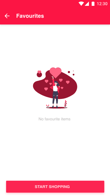
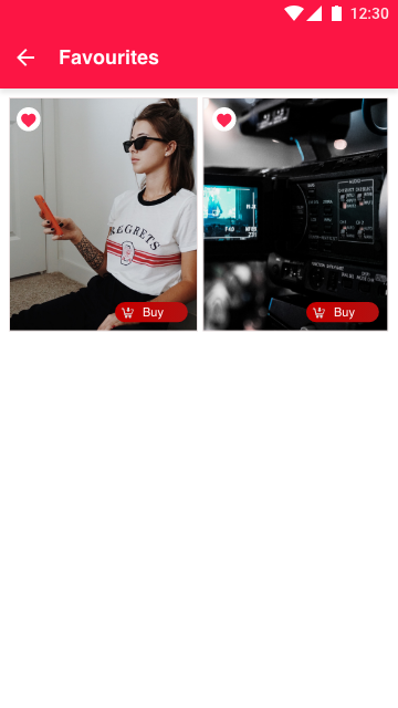
Profile hubs orders, payments, addresses and followed stores; favourites save the looks worth coming back for.

IMPACT · higher return rate

The full screen library

26 screens — tap any to open it full-size in a device frame.

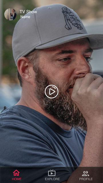
Splash
Splash
Live feed
Live feed
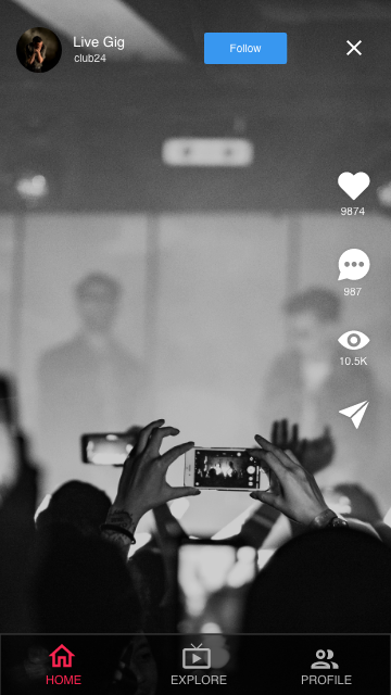
Video post
Video post
Live capture
Live capture
Explore
Explore
Explore — premier
Explore · premier
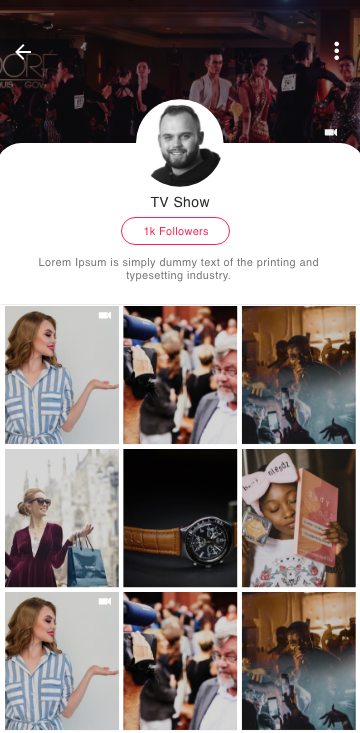
Creator profile
Creator profile
Product detail
Product detail
Live comments
Live comments
Live engagement
Live engagement
Signup
Signup
Verification
Verification
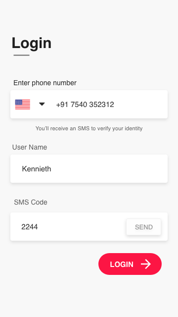
Login
Login
Favourites
Favourites
Favourites empty
Favourites · empty
Manage address
Manage address
Delivery address
Delivery address
Add address
Add address
Order now
Order now
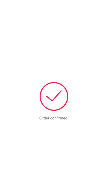
Order confirmed
Order confirmed
My orders
My orders
Track order
Track order
Payment options
Payment options
Add card
Add card
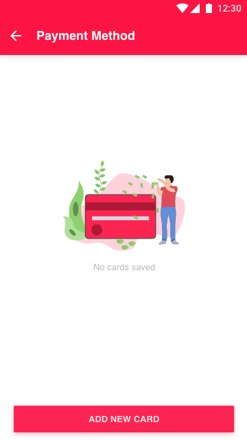
No cards saved
Payment · empty
Profile
Profile
WHAT I TOOK AWAY

The strongest design decision was a deletion: every detour I didn’t send the buyer on. Designing for a 10-second attention span meant protecting the stream as the one constant surface — and letting discovery, identity, payment and delivery orbit quietly around it.

Back to portfolio
{{ zoomImage }}